Multi-device responsive preview loads one URL into phone, tablet, laptop and desktop at the same time, and changing a preset, a size or the rotation does not reload the page.
The layout most people miss before a store goes live is the one on the customer phone. A page that looks tidy on a desktop can squeeze its buttons at phone width, push a product image off the screen and cut a form in half. Checking sizes one by one in developer tools means the phone, then the tablet, then another edit and a fresh start.
Four viewports on one screen remove that loop. Enter a URL once and all four load it together; a preset or size change only resizes the frame. Four size switches and four reloads become one entry.
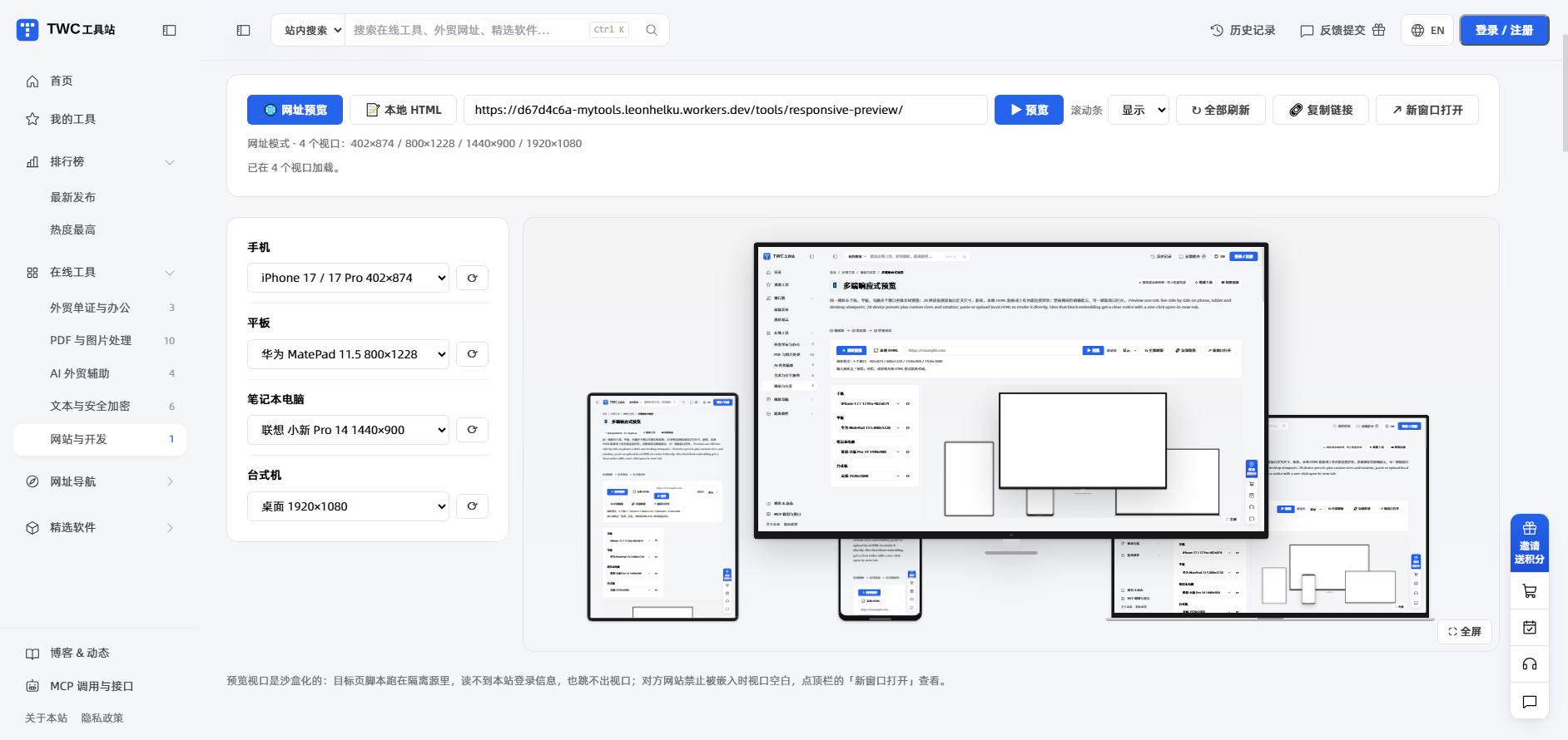
- Load four viewports at once and see every width
- Switch between 20 device presets or type a size
- Render local HTML without deploying first
- No account needed; the URL never reaches this site
Start in three steps
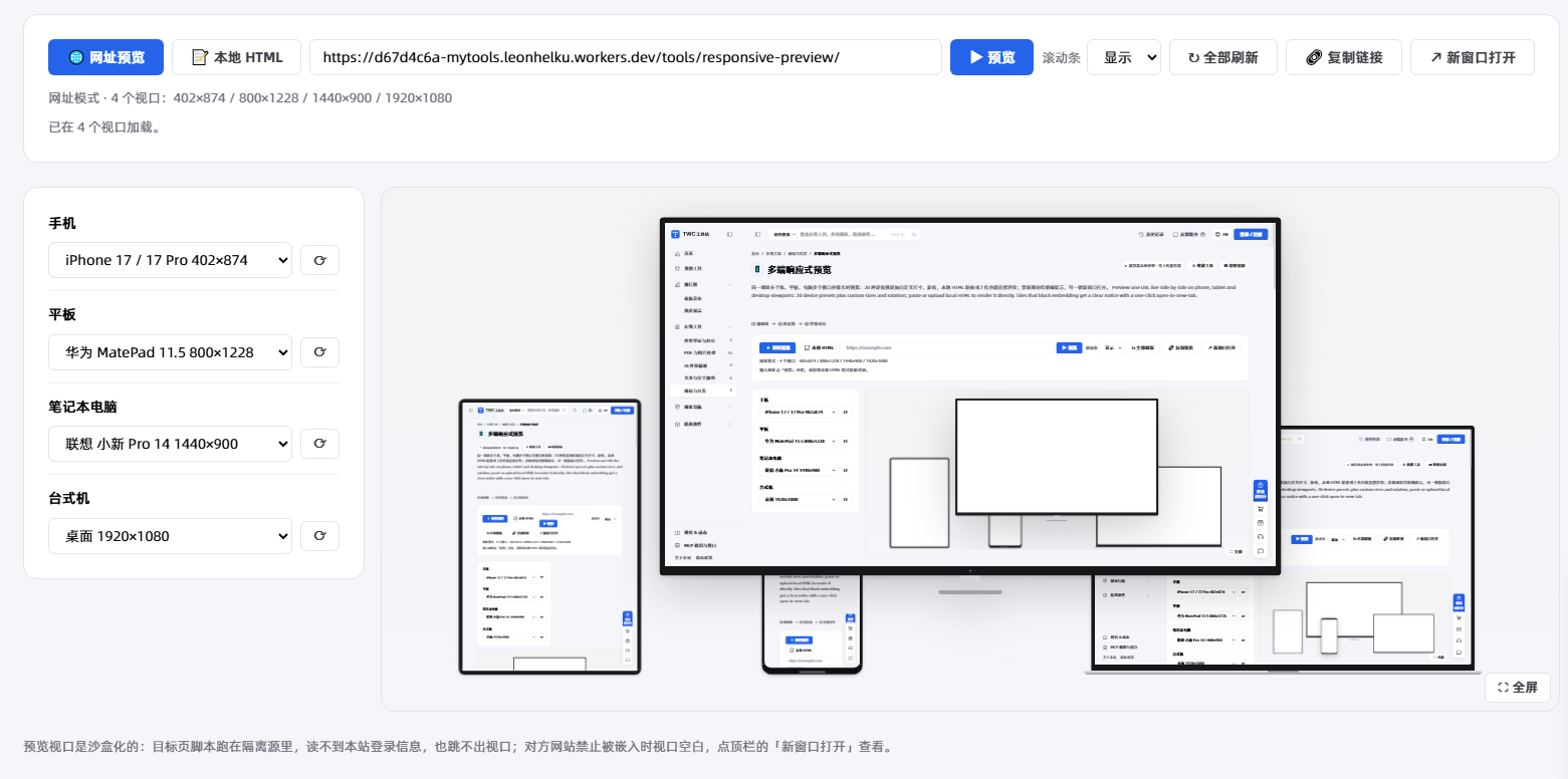
- Enter a domain or full link and click preview; all four viewports load that page.
- Pick a preset above each viewport, or choose Custom and type a width and height; the frame resizes without reloading the page.
- Click Copy link and send the address with ?url= to a customer or colleague.
A missing scheme gets https automatically. Only http and https are accepted, up to 2,048 characters. After a URL change, click Refresh all.
Core features in detail
Four viewports, 20 device presets
Responsive mode in developer tools holds one viewport at a time, and every size change reflows the page. Check the phone, switch to the tablet, edit the code, start again.
This tool pins phone, tablet, laptop and desktop on one screen, each with its own preset menu: 4 phone, 5 tablet, 8 laptop, 3 desktop, 20 in total. Links work and pages scroll inside a viewport.
With four widths side by side, you can see where a sentence wraps and where a button gets squeezed without memorising the last size.
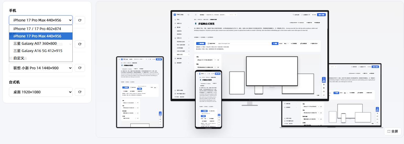
Custom sizes and rotation
Presets do not cover the breakpoints a project uses. A 360-wide phone or a 1024-wide tablet in landscape is in no preset list.
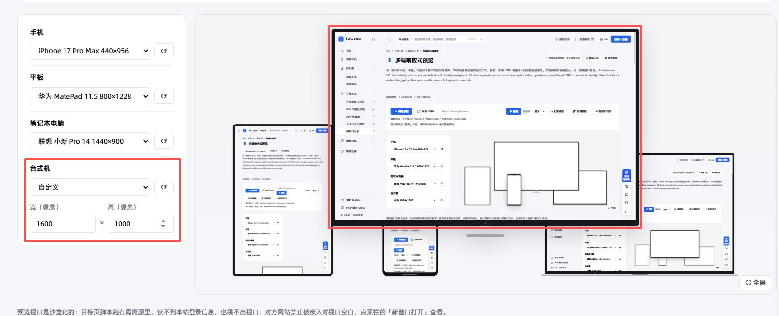
Choose Custom and type width 240 to 3840 and height 240 to 1600; values outside the range are clamped. Click ⟳ to swap width and height. Scrollbars can be hidden for cleaner alignment.
Enter 360, 390, 768 and 1024 once each and horizontal scrolling or long words pushing past their container usually show up.
Local HTML rendering
Every landing page edit means another upload and another wait for the cache, even for three words.
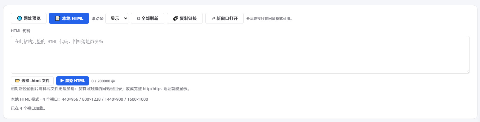
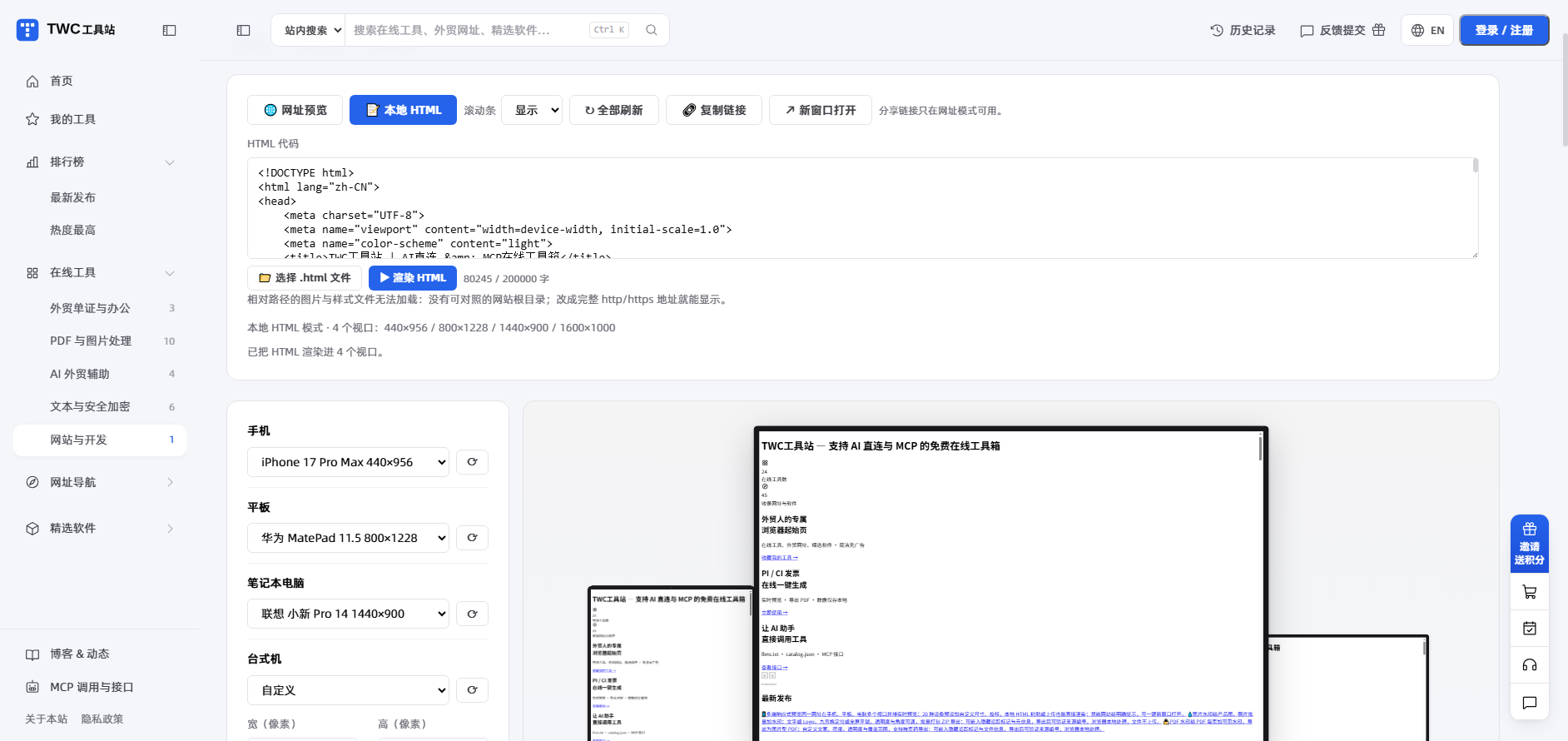
Switch to Local HTML, paste code, or choose an .html file up to 2MB, then click Render HTML.
All four viewports render that code, and another click refreshes them without a deploy. The code box takes up to 200,000 characters and warns when it truncates. Switching back to Preview a URL keeps the code.
Relative paths for images and styles will not load because there is no site root; use full http or https addresses.
Share links and blocked embedding
Send a screenshot and the other side sees a thumbnail. Which width broke is unclear, and the question comes back three times.
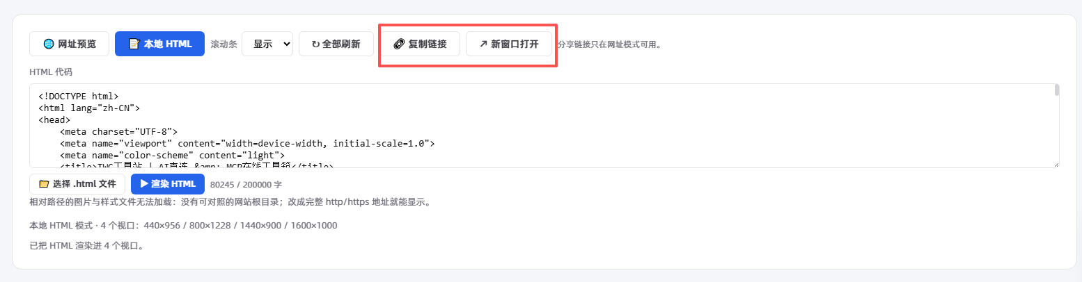
In URL mode, click Copy link to get an address with ?url=.
Anyone who opens it sees the same URL across four viewports, with no sign-up and nothing to install.
A blank viewport usually means the site blocks embedding with X-Frame-Options or a CSP frame-ancestors rule. Click Open in new tab. For your own site, remove the rule or allow tools.waoww.com.
Where it fits
Store operations: check the phone before launch
Most orders come from phones. Drop the URL in and check only the phone viewport: a badly wrapped heading, buttons too small to tap, images off the screen, a form cut in half. Then move to the tablet and watch where two columns become one.
Front-end work: run every breakpoint after a style change
No more switching sizes in developer tools. The four viewports stay open, one reload shows all four widths, and a broken breakpoint is obvious. If the project has its own breakpoints, type them into Custom.
Design review: compare wrapping and spacing against the handoff
Check the delivered page width by width: where the heading wraps, whether card spacing shrank, whether image ratios stretched. The screenshot carries the viewport width, so the developer does not guess.
How it differs from similar tools
Each approach has its place. Developer tools simulate touch, pixel ratio and throttling, but show one viewport at a time. Online multi-screen sites render in the cloud and suit teams that need archives and collaboration.
| Tool | Setup effort | Where it runs | Uploads data | Sign-in | Export | Price | Better for |
|---|---|---|---|---|---|---|---|
| Multi-device responsive preview | Open a page, nothing to install | In the browser, iframes load the target site | No upload; the URL stays local | No | PNG capture (copy / download / cloud) | Free | Four widths before launch without a deploy |
| Browser developer tools | Open the panel, find device mode | In the browser | No upload | No | No export; screenshot or record | Free with the browser | Simulating touch, pixel ratio and throttling |
| Online multi-screen preview sites | Open the page, submit the URL | On their servers | The URL goes to their server | Depends on the platform | Depends on the platform | Depends on the platform | Cloud archives and collaboration |
For local processing, four viewports at once and no sign-in, this tool fits better. For touch and pixel ratio checks, cloud archives or team collaboration, developer tools and a platform with a backend serve you better.
Advanced tips
- Type breakpoints into Custom: 360, 390, 768 and 1024 surface horizontal scrolling and clipped text faster than presets.
- Hide scrollbars before a screenshot; aligned frames compare better. Then click “📷 Capture screenshot”, allow sharing “This tab”, and the tool crops the four-device scene for you.
- Check in Local HTML, deploy, then send the ?url= link so the customer verifies the live page. Both rounds look at the same code.
Limits and when not to use it
- It simulates CSS pixel width, height and scaling only. Pixel ratio, touch gestures, system fonts and browser differences are not simulated, so verify those on a real device.
- The viewports keep no login state, so pages behind a sign-in are not a good fit.
- The frames stay at one phone, one tablet, one laptop and one desktop, one URL at a time.
- The capture is one frame of the page cropped to the preview scene: it needs permission to share “This tab”, and you must capture again after changing a device or URL.
- A share link carries the URL only; local HTML does not travel with it.
- Limits: 2,048 characters for the URL, 200,000 for the code box, 2MB for the .html file.
FAQ and summary
Four viewports save switching time; they do not replace a real device. Obvious layout problems show up before launch, while touch feel, high-DPI rendering and system fonts still need a phone.
👉 Open Multi-Device Responsive Preview now, drop in the page you are working on, and check all four viewports before it goes live. For problems, use Feedback in the header or Leave a message in the floating bar.